Progress Indicator (Component)
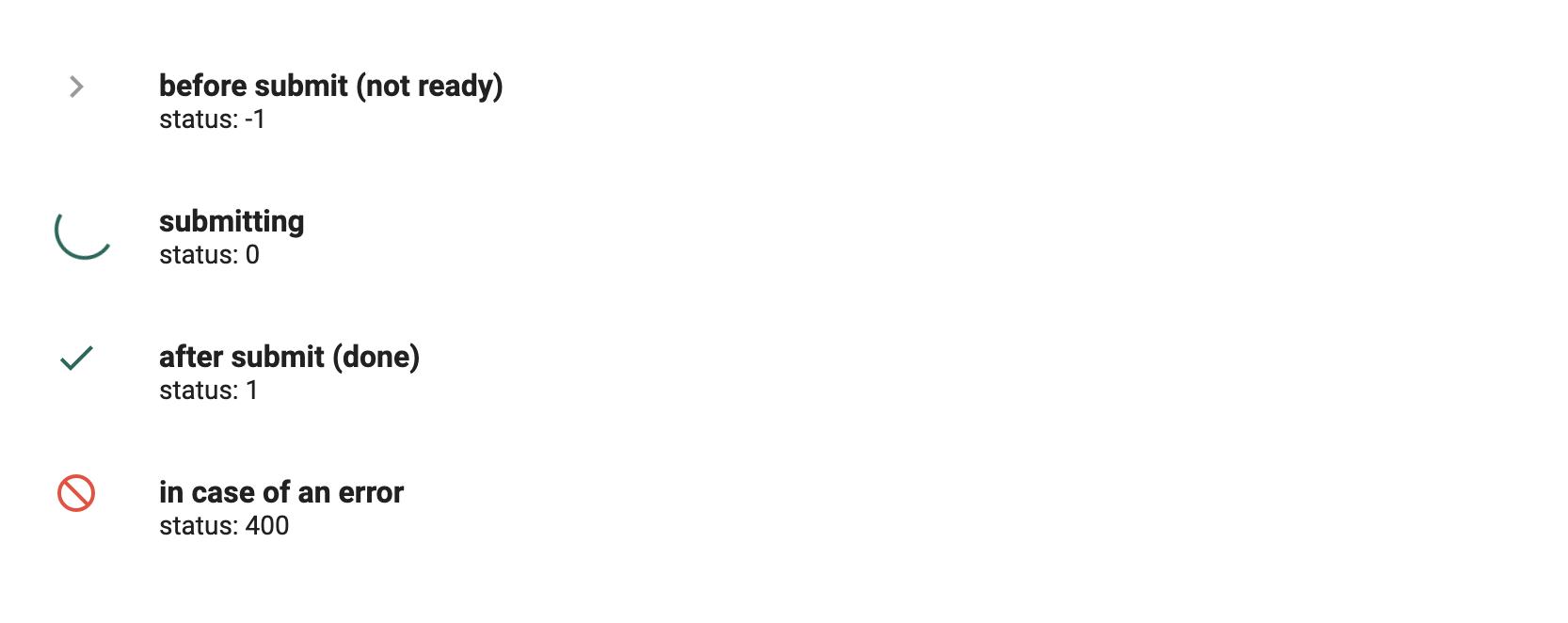
The progress indicator can be used to show the status of loading something. This can be the simple loader or in case of submitting data it can show the status (not ready, loading, done or error).
Parameters
| Name | Type | Description |
|---|---|---|
| status (optional) | number | [status] is a number and can be used when submitting form data: - not ready: -1 - loading: 0 - done: 1 - error: 400 |
| color=primary (optional) | string | Parameter to customize the appearance of the loader. Hexadecimal color value e.g. #00ff00 or similar color values 'red', 'green' etc. |
Examples
You can use the progress indicator in two ways:
Classic Loader
HTML file
<dsp-progress-indicator></dsp-progress-indicator>
### Submit-form-data loader e.g. as a list style type while submitting form data  Angular Material Icons is required. You have to import the style file into your app and add the following line in your main styling file: `@import url('https://fonts.googleapis.com/icon?family=Material+Icons');` We recommend to host the Material Icons font in your app e.g. by using the [Material Icons package](https://www.npmjs.com/package/material-icons).
### Dynamic example of Submit-form-data loader   
Last update: 2021-08-13